
Best Motocross Clothing for Photos: 2026 Style Guide
Table of Contents
- What Makes Motocross Clothing Look Best in Photos
- Quick Comparison: Top Motocross Clothing Picks for Photos
- Motocross Gear Color Coordination for Standout Photos
- Custom Motocross Jerseys for Photos: When to Go Personalized
- Lighting and Material Reflection: How Fabric Affects Your Shot
- Gear for Beginners vs Pros: What Photographs Best
- Frequently Asked Questions
Last Updated: September 24, 2026
What Makes Motocross Clothing Look Best in Photos
The best motocross clothing for photos combines high-contrast colors, matte or satin fabric finishes, and a clean, uncluttered silhouette that separates the rider from the dirt and sky behind them. This guide from Moto Dad Racing breaks down exactly what to wear when the camera is rolling, from helmet graphics to boot color.

Most riders obsess over safety ratings and ignore how their kit reads on camera. That is a mistake. A dark jersey against dark dirt disappears. A glossy finish catches the sun and blows out the highlights. The gear that looks aggressive in motion often looks muddy in a still frame.
Below, we cover the seven factors that separate a sharp photo from a forgettable one, plus a comparison table of our own picks for families who want to look coordinated without trying too hard.
Quick Comparison: Top Motocross Clothing Picks for Photos
Here is how our top picks stack up for riders who want gear that photographs as well as it performs.
| Product | Price | Fabric | Best For |
|---|---|---|---|
| Moto dad racing 1 | $22.99 | 6 oz. 100% USA cotton | Bold graphic shots, high-visibility safety colors |
| Ride 2 - new | $27.99 | 4.5 oz. ringspun cotton | Clean, saturated color that holds up in bright sun |
| Ride 2 | $28.99 | Tri-blend jersey | Soft drape, low-sheen finish for golden-hour shots |
| Man myth racer | $28.99 | Tri-blend jersey | Subtle heather texture that adds depth to flat lighting |
| Father son Tee | $28.99 | 100% polyester interlock | Moisture-wicking, sweat-free look during long shoots |
The pattern here is simple: heavier cotton reads as more saturated in photos, while tri-blends and polyester interlock give you a softer, more natural fall of light. Pick based on your lighting conditions, not just your favorite color.

Motocross Gear Color Coordination for Standout Photos
Color coordination is the single biggest lever you control before you ever get on the bike. A coordinated kit gives the eye a clear place to rest, and it separates you from the chaos of the track. None of the top-ranking safety guides address this, because they are written for buyers, not for riders who want a frame worth printing.
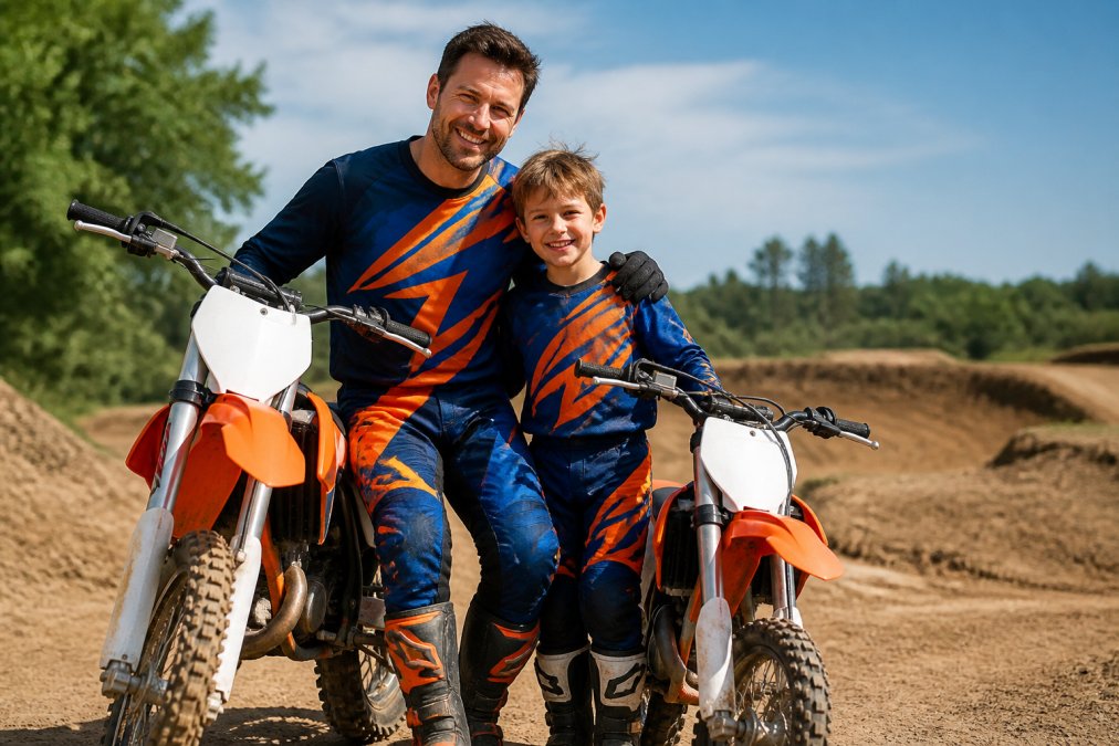
Start With the Background, Not the Jersey
Most riders pick gear in a vacuum. Photographers do the opposite: they pick gear against the surfaces it will sit in front of. At a typical outdoor track, that means three dominant backdrops, tan or gray packed dirt, green tree lines or hills, and a bright sky that occupies the top third of most vertical shots.
That gives you a simple contrast map:
- Against tan/gray dirt: blues, teals, and deep reds pop hardest. Black and dark brown sink into the dirt and read as a silhouette blob.
- Against green tree lines: orange, red, and yellow separate cleanly. Green-on-green disappears.
- Against bright sky: dark jerseys create a strong rim silhouette; white jerseys blow out and merge with the clouds.
The practical takeaway is that a kit that looks great in a showroom can vanish on the track. If you shoot at one home track most of the year, match your palette to that track's dirt and foliage, not to a catalog.
The Three-Color Rule (and Why It Works)
The rule most working photographers use is simple: one dominant color, one accent, one neutral. If your bike has red plastics, wear a black or white base with a red accent. If your bike is blue, lean into orange or yellow for contrast. If your bike is green, red or orange gear will read as intentional rather than accidental.
Where riders go wrong is treating the bike as a fourth color. Your bike graphics are already a palette. Pull one color out of the graphics and repeat it in your gear, then let everything else stay neutral. That single repeated color is what makes a photo look styled instead of random.
Match the Helmet Loosely, Not Exactly
What most guides miss is that your helmet should not match your jersey exactly. A slight variation in tone creates visual separation between the head and torso, which makes the rider look sharper in profile shots. Matching too closely flattens the whole image into one shape.
A reliable pattern: if the jersey is a saturated color, choose a helmet in the same hue family but one or two shades darker or lighter. If the jersey is neutral (black, white, gray), let the helmet carry the bold color. The helmet is the focal point in most motocross photos because it is where the eye lands first, give it something to say.
Coordinate Families by Color Family, Not by Uniform
For families riding together, coordinated color families beat matching outfits. Dad in a black and red tee, kid in white and red, reads as a team without looking like a uniform. That is the balance Moto Dad Racing designs around.
The mechanism is simple: shared accent color, different base colors.
Custom Motocross Jerseys for Photos: When to Go Personalized
Custom jerseys pay off in photos when you want name and number ID to be legible. If your shots are going on social media or a family album, personalization adds a layer of meaning that generic graphics cannot.
Lighting and Material Reflection: How Fabric Affects Your Shot
Fabric finish matters more than most riders realize, and it is the single factor that separates a photo that looks professional from one that looks like a snapshot. The reason comes down to one word: reflection.
The Three Fabric Finishes You Will Actually Encounter
Matte (100% cotton, brushed cotton). Diffuse reflection. Absorbs light evenly, holds color saturation, and never blows out. This is the safest choice for harsh midday sun, which is when most track photos are actually taken. The trade-off is that matte fabric can look flat in overcast light because it gives the camera nothing to work with.
A Time-of-Day Decision Framework
Instead of memorizing fabrics, match the finish to the light you will actually be shooting in:
- Midday sun (10 a.m.-3 p.m.): matte cotton. Hard light plus specular fabric equals blown highlights. Diffuse fabric is your only reliable option.
- Golden hour (within an hour of sunrise or sunset): low-sheen tri-blend. The warm, low-angle light rewards a little highlight.
- Overcast or shaded tree line: polyester interlock or any low-sheen blend. Flat light needs a fabric that adds dimension back.
- Dusk, indoor, or arena lighting: reflective or high-sheen graphics become an asset instead of a liability.
The Color-Saturation Trade-Off
There is a second mechanism at work that most guides ignore: darker, matte fabrics read as more saturated in a photo than lighter, shinier ones. A deep red matte jersey will photograph as a richer red than a bright red glossy jersey under the same sun, because the glossy fabric is reflecting the sky back at the camera and washing out the pigment.
What This Means for Your Kit
You do not need to own three sets of gear. You need one matte kit for bright-day shooting and one low-sheen kit for soft-light shooting, and you need to know which is which before you load the truck. Check the fabric content tag: 100% cotton is your midday kit, tri-blend is your golden-hour kit.
Gear for Beginners vs Pros: What Photographs Best
Beginners should prioritize contrast and comfort over graphics. A simple, high-contrast kit in a matte fabric will photograph better than a busy pro-style jersey almost every time.
For everyone else, simpler is sharper.
- One dominant color, one accent, one neutral
- Matte or low-sheen fabric
- A helmet that contrasts slightly with the jersey
- Clean, well-fitted gear that does not bunch
- Boots in a neutral tone so they do not pull focus
Frequently Asked Questions
What colors look best in motocross photography?
Bright, high-contrast colors like red, blue, yellow, and green stand out against dirt tracks and green backgrounds. Avoid muddy browns or dark grays that blend into the terrain. For motocross gear color coordination, pair a bold jersey with contrasting pants and helmet. The Moto Dad Racing Ride 2 tee in heather grey offers a neutral base that works with any bike color.
Should I wear matching gear sets for photoshoots?
Matching sets create a clean, professional look, especially for family or team photos. However, subtle coordination often works better than identical outfits. Try matching one element, like jersey color or helmet design, while keeping the rest complementary. The Father Son Tee from Moto Dad Racing is designed for coordinated family looks without being overly loud.
Are custom jerseys better for motocross photos?
Custom motocross jerseys for photos add personal branding with your name, number, or team logo. They photograph well because they tell a story and stand out in group shots. The Moto Dad Racing Man Myth Racer tee keeps a classic tri-blend fabric that photographs without harsh reflections. Custom jerseys are worth it if you want a unique, professional look.
How does lighting affect motocross gear choice?
Bright sunlight can wash out light colors and create harsh shadows, so mid-tone or saturated colors work best. Overcast days soften shadows and make dark gear look richer. Moisture-wicking fabrics like the Sport-Tek ST350 on the Father Son Tee reduce visible sweat, keeping you dry and photogenic. Avoid highly reflective materials that cause glare.
What is the best motocross apparel for a professional look?
For a professional photo, choose clean lines, coordinated colors, and well-fitted gear. The Moto Dad Racing 1 tee in Safety Green is ANSI/ISEA 107 compliant. Pair it with neutral pants and a solid helmet. Avoid busy patterns that distract. A classic crew neck like the Ride 2 - new offers a sharp, timeless appearance.